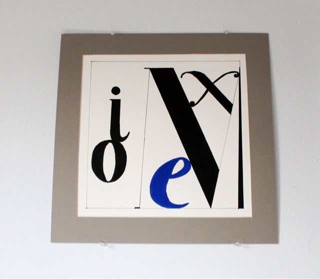
Woah, this was a challeging assignment! Not only had I never attempted to draw letter forms taking into account negative (white space) and positive space, but I also had never painted such precise shapes & angles. I was really happy with my design, even though I still need to work on my painting technique a bit more. My hand was a little shaky while I painted some of the round angles because I didn’t think of using tape there. Next time I know better. A classmate gave a quick lesson last week on how to manipulate tape to cover around curved edges. It helped out a lot in my last project (color wheel design). When I look at the letters I designed, they make me smile because they look quite playful. Especially the letter “e” underneath the “M”, and the “i” sitting on top of the “o”. Hope you like it.
